Radikally Different - Our World View

Mobile App Faults That Damage User Retention
User retention is the most important goal for businesses around the world. With mobile audiences remaining volatile, client acquisition is not held in high value anymore. Rather, a shift in trend has set in where mobility enterprises have started attaching high value to client retention. Soon after launching a mobile application or a game it is hard for you to see your retention rates slowing down or dropping sharply. The exact causes may often remain in the dark. However, being a part of the mobile industry we can only address user interface (UI) and user experience (UX) as the relevant causes for drop in user retention rates. The most minor major design flaws and erroneous navigation structures result in damaging user retention. Given below are a few most common UI and UX faults:
Users Run Away Due to Permissions
Once a user experiences a permission like ‘app would like to access your camera’, it is most likely that he/she runs away as fast as he/she launches an app. There are high chances of him/her never returning to use the app. This can be really scary for app owners as users must never run away to a point of no return. There must be features, technicalities and functions built in an app that not only engages a user but also lets him stay.

It is quite natural for an app to be location-based, contact based or can send push notifications. However, if we see things from a user’s point of view we may understand the common dislike for such settings and preferences.
Permission settings must be controlled at all cost. It must be thought over by the mobile app makers to not include too early permissions or to develop a positive user experience of some kind. Users must not be asked to submit too many information about their personal devices. There is a common tendency to be scared!
Making minor changes to UI permissions can make huge differences in creating optimal user experiences. Some of the most common permissions include (largely considered annoying) include:
- App would like to access your contacts
- App would like to access your camera
- App would like to access your locations
- App would like to send you push notifications
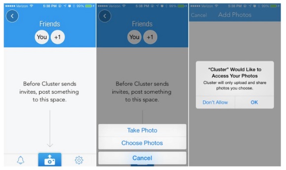
There are several ways that these permissions can be placed strategically by using them in accordance with time and relevance. We can take a very good example in the way Cluster asks its users for photo access.

The point is not to irritate or scare off a user but at the same time include meaningful change to the permissions UI of an application. These little steps go on to make bigger differences in UI which further improve client retention. User acceptance rate increases effectively with the inclusion of intelligent UI concepts and checklists.
Dialogue Boxes Without Hints
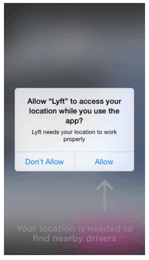
Robotic commands tend to scare off mobile users. With a dialogue box asking for a permission to access a user’s location/contact/camera features must have a personal guide. A visual prompt similar to the one used by Lyft application can do wonders in generating a sense of permitting access for users:

No Checklist No Retention
To have an optimal user experience an intelligently designed checklist system must be incorporated in your mobile application. We can take a hint from the stunningly designed checklist-based user permissions UI by Periscope notification app. Only when a user chooses to broadcast their video a checklist appears on screen:

Zero Daily Dependency Factor in Your App
You create a mobile application solely to engage your users is such a manner so that they start depending on your app. The attraction (usage metrics) towards your app should be 100%. This should be your only aim in achieving a feat in the mobile app marketplace.
Rolling numbers (statistics) of present day user retention are really astonishing. Recent surveys (carried out by multiple mobile statistical survey agencies around the world) suggest that most apps lose 90 percent of their early users. In a span of 3 months these numbers tend to decrease rapidly and land a massive low of 95 percent. In order to retain users, an ultra positive and super consistent user experience comprising of relevant notifications and rewards must be included in an app.
Read Also: Why is Usability Testing Important For Mobile And Web Applications?
There are numerous apps that are placing themselves high in the user retention race. User actions on daily basis need to be tracked and rewards/notifications must be generated accordingly. Uber is a good example that makes great use of daily user actions (people going from one place to another).
Creating dependency factors is important. This not only makes way for enjoyable UXs but also talks care of exceptional app models. Having daily user dependency will enrich your overall user acquisition strategies.
Designing a market viable app model and stunning user-centric features will never fail you in your user retention goals. Ultimately the only aim we all have is to reach the top spot in app development. Once an app fits smoothly into a user’s life, the successful journey to the No. 1 spot in app marketplace begins.
- Augmented Reality (4)
- Enterprise (9)
- Games (15)
- Marketing (17)
- Mobile App Development (26)
- Mobile Apps (19)
- Mobility Solutions (1)
- Monetization (8)
- News (16)
- Remote Hiring (1)
- Strategy (13)
- Testing (7)
- Uncategorized (1)
- User Experience (8)
- Virtual Reality (4)
- Web Browsing (1)
- Web Design & Development (20)